01 Dec How to Draw Basic Descriptive Plots in R
In this tutorial you will learn how to create nice-looking plots using basic R functions. There are a handful of packages in R dedicated in plotting with rich parameterizations but in this post our goal is to keep it simple and create some basic plots that are functional as well as informative, with only a few lines of code.
scatter plot
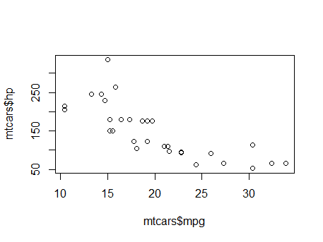
Using the mtcars dataset existed in core R, with the following function we create a scatter plot that depicts the horsepower and mileage of the cars existed in the mtcars data frame.
plot(mtcars$hp, mtcars$mpg)
The result of the above line looks like the following graph:

In this post we will highlight some basic functions for plotting using R statistical language and it will become clear that creating informative charts requires only a few lines of basic plot commands.
line plot
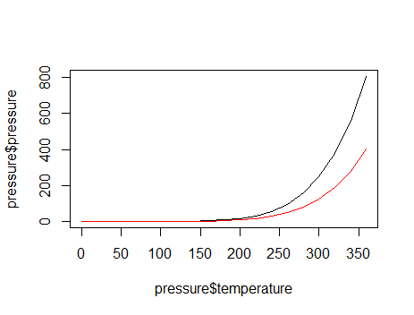
In order to create a line plot, we pass in the x and y arguments of the plot function two different vectors. For example, the following line of code creates two lines; the first one with the default black color and the second one with red color:
plot(pressure$temperature, pressure$pressure, type = "l")
lines(pressure$temperature, pressure$pressure/2, col="red")
The result of the above code looks like the following graph:

bar graph
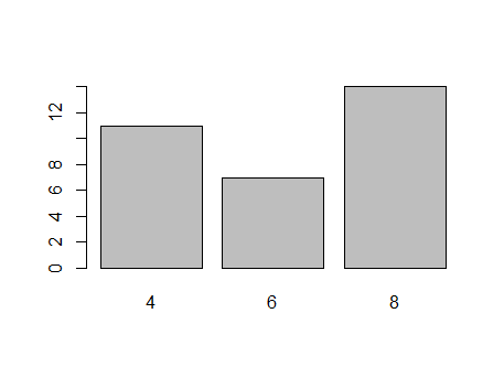
A bar graph is a graph where the bars represent the count of cases in each category. It is similar to a histogram, but has discrete instead of continuous values in the x-axis.
t<-table(mtcars$cyl) #getting the counts of each unique value
barplot(t)
The bar graph below depicts the number of cars in the mtcars data frame that have 4, 6 and 8 cylinders:


Sorry, the comment form is closed at this time.