06 Dec How to Draw Basic Descriptive Plots in R with ggplot2
In this tutorial you will learn how to create nice-looking plots using basic functions found in ggplot2 package in R. This package is bulit to provide professional looking plots with minimal coding.
scatter plot
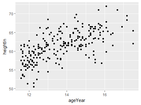
Using the mtcars dataset existed in core R, with the following function we create a scatter plot between the two variables ageYear and heightInas in the dataset gcookbook:
library(gcookbook) # For the data set
ggplot(heightweight, aes(x=ageYear, y=heightIn)) + geom_point()
The result of the above line looks like the following graph:

A common altrnative with the above scatter plot is to use hollow circles instead of solid ones:
ggplot(heightweight, aes(x=ageYear, y=heightIn)) + geom_point(shape=21)
To control the size of the circles in the graph we specify explicitly the attribute size:
ggplot(heightweight, aes(x=ageYear, y=heightIn)) + geom_point(size=1.5)
In this tutorial we will highlight some basic functions in ggplot2 package for plotting. It will become clear that creating informative and professional-looking charts requires only a few lines of basic plot commands.
line plot
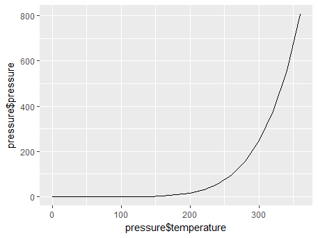
In order to create a line plot, we pass in the x and y arguments in the function. For example, the following line of code creates sequential points connected with lines for the x values depicting temperature and y values depicting pressure:
qplot(pressure$temperature, pressure$pressure, geom="line")
The result of the above code looks like the following graph:

To modify the above graph and add points with line graph, we type the following:
qplot(pressure$temperature, pressure$pressure, geom=c("line","point"))
bar graph
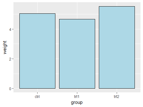
With the following line we create a basic bar graph:
ggplot(pg_mean, aes(x=group, y=weight)) + geom_bar(stat="identity")
In order to modify the bar graph we change or add attributes to the ggplot function used above. For example, if we want to fill the bar chart with color and also explicitly specify each bar’s borderline color, then the following line will do the job:
ggplot(pg_mean, aes(x=group, y=weight)) +
  geom_bar(stat="identity", fill="lightblue", colour="black")


Sorry, the comment form is closed at this time.